2022/03/31

Demo Version! Dengeki Sentai Changeman and Gosei Sentai Dairanger!


My CD Collection is vast and truly all encompassing...but once in a blue moon I score a new CD for the collection that is so monumental that I need to dedicate a post to it.

I am not going to write a full review this time...I am just going to share (pieces) of what I've discovered. The CD in question is Katsuo Ohno's Maboroshi no Melody Vol.5 ~Ohno Katsuo maboroshi no Demo Tape ongen~ from 2008. It is the last in a series of demo tapes released by Ohno between 2003 and 2008. This is the only one that is relevant to my little mission--and also the most difficult to find.


I have been looking for this CD for years. It was released quietly in 2008 and after missing the initial run I was left to watch and wait. I had a couple of misses over the years before FINALLY scoring a reasonably priced used copy in March of 2022. 

The disc features several tracks that I am completely unfamiliar with...but five that I am *very* familiar with...


Dengeki Sentai Changeman Demo Track Medley


The liner notes give some very basic information on the series, the singer of the final version (KAGE/Hironobu Kageyama) and mentions that Ohno was also responsible for Mermaid & Phoenix as well as Soldier Dragon ~ Yuusha no michi despite not being present in this collection.

I dig the subtle difference in NEVER STOP Changeman...including the more subtle intro. I shared these with Changeman superfan Shogo B'Stard who immediately noticed the different lyrics, which inspired me to just post them up...so here you go:

NEVER STOP Changeman


GREAT PASSION~Jounetsu no arashi~


LOVE FOREVER


I should probably note that the demos for both of these songs are full versions. Pretty neat, huh? I only used snippets for each track because the whole situation seems somewhat nebulous. This CD is *rare* and I don't know if Toei/Ohno really want the whole things out there.

The demo for GREAT PASSION is probably the biggest difference of the lot and it's pretty obvious that Naomi Miyanaga's effortlessly perfect vocals in LOVE FOREVER are what make that song as great as it is.

Gosei Sentai Dairanger Demo Track Medley

These are a ton of fun.


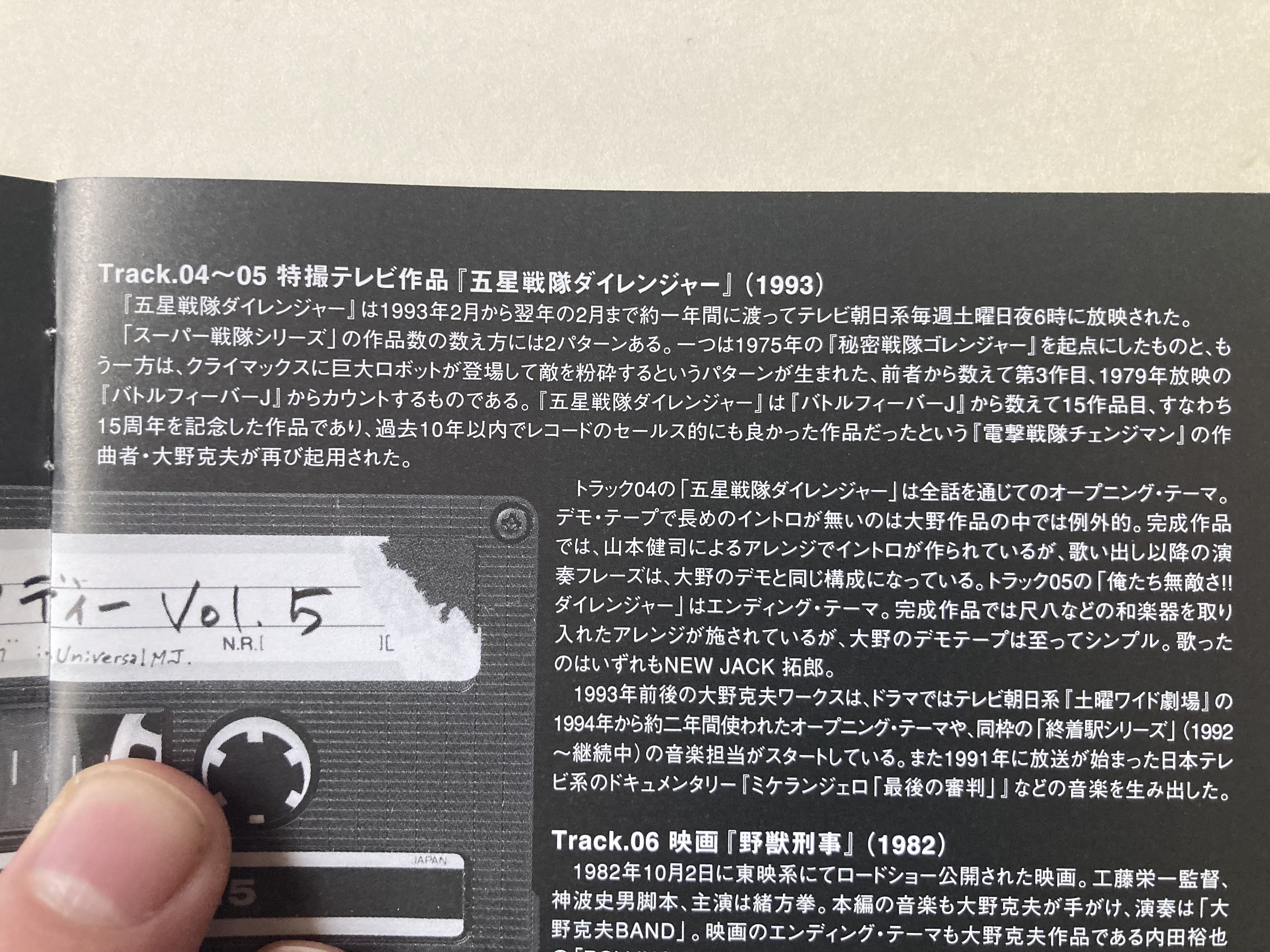
The liner notes on this one are kinda funny. It talks about how Sentai started with either Goranger or Battle Fever J depending on how you look at it. It then goes on to say that these are unusual for Ohno in that they are only short, structural demos for how the lyrics should be sung...which tracks since the end songs match this pretty well. Kenji Yamamoto (infamous plagiarizer) was in charge of the arrangement and brought in more traditional sounding instruments like a shakuhachi for the final version.

That makes a lot of sense since these songs are pretty revolutionary--especially the ending song Oretachi Muteki sa!! Dairanger. Speaking of...the only major lyrical change is in this song where "Oretachi muteki sa!!" becomes "Oretachi muteki da!!". This isn't in the snippet, but you get the gist.

Gosei Sentai Dairanger & Oretachi Muteki sa!! Dairanger


I thought this would be fun to share these virtually unheard demos. Enjoy...and please don't bug me for the full versions. Haha.


-CC

Reebok X Power Rangers -- HUH?

If it weren't for a random ad on a website, I wouldn't even know this was a thing...

Today I'm going to take a look at possibly the most bizarre major merchandise collaborate I've ever come across--the Reebok x Power Rangers line. As a dude who really digs sneakers, I was intrigued by the concept. I bought a pair of Tron adidas back in 2006 and the year before I bought several pairs of the adidas Superstar Anniversary sneakers...which included my all-time favorite sneaker (the blue suede Superstar).

Feet are gross, so I can appreciate un-gross things to cover them up is what I'm getting at. Let's take a look at these Power Rangers Reeboks and see how they turned out.

------


Power Rangers Question Mid Basketball

I'll start with what I believe was the original shoe (?). This is the Megazord themed sneaker that draws in some vaguely memorable styling and color cues without being too overbearing.

This one...is alright I guess? I give them points for being asymmetric in a world where your two shoes should match. They're fine. I respect the game, but I wouldn't wear them. 

The trick box is kinda neat I suppose.

------

Power Rangers Classic Leather

This is the blandest fucking shoe I've ever seen. How is this even part of the line?

------

Power Rangers Answer IV Men's Basketball

I kiiiiinda dig this Lord Zedd themed sneaker with the tubing looped around to the heel. Outside of it being woefully impractical and possibly being a tripping hazard, it's neat.

I think the only thing about it that I actively dislike is the location of the zipper...and possibly the silver. I get it--it fits with the theme. Silver shoes like that just don't work in the real world, though.

Yeah, like I said...this one is kinda sorta OKish. It certainly looks better from a distance. 

Good from afar, but far from good lookin'.

------

Power Rangers Instapump Fury 94

This one really saddens me. As a dude who had a pair of Reebok Pumps in the 90s, I was hoping they would do something cool with the design in this line. Nope! Instead we are given the fugliest shoe that I've ever ever ever seen.

On the other hand...this shoe leaves zero-doubt to what it is or who it is trying to pay tribute to. The details are there, and I'm sure that this designed meticulously up close without ever taking a step back to check their work.

Truly headache inducing...

------

Power Rangers Zig Dynamica

You know what...? This might be my pick of the bunch. It's discreet, but it gets the job done perfectly. The pentagram on the tongue of the left shoe is a really cool touch. Not to mention, the shoe itself looks pretty cushy. Its everything the other shoes in this line aren't!

It may not be my style, but I can get behind this!

------

Power Rangers Hurrikaze II Low

Saving the best for last!

Kidding! This is by far and away the biggest disappointment of the bunch.

First off...as you may know I am a major fan of Ninja Sentai Kakuranger. I will jump at any chance to add to my collection. The problems here are numerous...

-Why did they pick the Grandpa shoes as a base?

-If they were going to go with such a bland design, why not go big and make the left shoe camouflage and the right shoe white??

-The 90s Bandai "EVIL SPACE ALIENS" is so out of place on the tongue.

-"I got a life and I'm lovin' it". Is that a thing??

This is the one that I got the ad for on a random site that introduced me to this line. I was drawn in by it's badness and kept a consistent stream of disappointment as I saw what else was up for grabs.

------

Ummm...so that's that for that. You can check out the shoes on the Reebok site here, or you can wait until the next Power Morphicon to see them in action against bad convention hall carpeting. 

Anyway...Bye!

-CC

Hang on a minute...

Boots with the fur?

Reeboks with the strap??

Hurrikaze II LOW???

I can't be the only one who noticed!


PREVIOUSLY...

2022/02/28

B-Fighter's B-Commander BS [Jukou B-Fighter B-Commander Complete Edition]

This is completely random, isn't it?

I've been a fan of Bandai's retro releases and have been keen to pick up, well, most of them. We got some cool Sentai releases under the Super Sentai Artisan line, but that has kinda faded out over time. This time around, one of the better toy lines from the 90s is getting some love.

We're getting a reissued B-Commander set!

Now...I know that B-Fighter isn't the most exciting series, but it is an awesome toyline. I've owned every toy from the series and have always held the B-Commander in high regard. It's pretty awesome, no? 

This isn't something that I would normally dedicate a post to, but I just have to get this off my chest...

Bandai has done some extra-top level nonsense by not only limiting sales to Premium Bandai, which is...fine, but they completely geolocked the damn product listing. That's right. Unless you're using the right VPN, you can't even view the damn site.

It's amazing how far Bandai will go to limit sales of their own stuff to the point where you can only see the crumbs of availability from their twitter account. Then they get all shocked Pikachu when nobody buys their expensive, only available for a two month window, and now GEOLOCKED web shop toys. It's a problem when their stuff immediately goes on to be scalped and never comes back down to Earth.

You know what? I still haven't seen the site. I sent the link to my friend and asked them to buy me two. Good job, Bandai. I still bought it. I have no idea how much money I spent, but I put an order in for two.

-----

The toy itself is worth talking about. 

It comes with a stand, two sets of figures, and interchangeable antennae...?

Hang on...I am fortunate enough to own a couple of the 1995 B Commanders and I can say without a doubt that one of the coolest things about it is the slick storage feature for the different modes. This goes beyond clever things like Doron Changer's Medal slot. The G Stag antennae fold down on both sides while the Blue Beet and Reddle antennae fold over the backside. It's very smart, and due to that I think some lightly abused toys that otherwise would've had missing antennae still had them. Granted, the mini figures were always missing, but it's still passable without them.

The new slot-in antennae are pretty weak. I'm sure it was done to make way for the new personalized sound clips by Daisuke Tsuchiya, Shigeru Kanai, and Takashi Sasano (really?? They had two Reddles and they couldn't get either??). Personally I more excited for the Henshin sounds since B-Fighter had a top tier sequence.

I like the addition of the transparent mini figures as well...and the new details painted into an old classic. I haven't even gotten my hands on this yet and I seriously love this toy. June is going to be awesome...

Seriously, this being locked out of the West is some supreme lunacy. The places you can buy this are charging a huge Bandai tax on this one. Good luck if you're in the market...

Let's see if we'll get the Command Voicer while they're at it. That toy has *the* most satisfying feel of any toy I can think of...you know, when you slide that card in. It's such a great feeling. Why stop there? Maybe we can get a *real* version of the Insect Commander? Instead of that three card nonsense we got first time around...

Looking forward to June!

-CC

PREVIOUSLY...

HASn'tBRO

The topic of Hasbro taking over the Power Rangers properties has been one of intrigue, optimism, frustration, and annoyance. In that order.

2018: We are given the news that Saban was ditching Bandai and awarding Hasbro the rights to manufacture Power Rangers toys (with the option to gain full control of the franchise in the fine print).

2019: It's here...we get an overdue Go-Busters adaptation and the birth of a promising, yet shoddy figure line called the Lightning Collection.

2020: A year in and it's all but confirmed at this point that Hasbro killed Super Sentai DVDs in North America and...quality control is still lousy.

We're now four years removed from the announcement of Hasbro taking over the franchise and...I'm done. It's more fair to say I was never in. I bought the Lightning Collection White Ranger, grimaced at the lousy quality, and went on with my life. That is 100% of my Hasbro Power Ranger toys.

Maybe I'll get that Ecliptor and...Empress...Skank (???--legit know nothing about anything post like season two of MMPR) set, but it's such a battle to make sure you get a figure with decent quality control that I probably won't bother.

Zord Ascension Project

...or...

Hasbro has some horrible NFT scam happening where you knock three times, pray you're in the right time zone, find the right glory hole, and maybe you'll get a special paint job on your Megazord (that's how those things work, right?). 

That wasn't my biggest "problem", though. I posted an image of the familiar logo in jest and got some idiotic reactions. This is why I don't tweet much anymore. 

I know there are people out there who inherently cannot detect sarcasm and/or take what they read literally. When I tweeted this out last week, I wasn't upset. I wasn't mad. I was more baffled at the course of pure ignorance than Hasbro has been on during their stewardship of the Power Rangers franchise.

The only thing I've genuinely tweeted in anger is that time I called Mark Wahlberg a piece of shit...he...is just human feces. 

So yeah, those responses ranged from...

"Nuh uh...that's not the Zyuranger logo" to "Maybe, but they have the right to use the logo as they please" to people that follow me liking *only* the tweets from people giving me shit. (Bruh)

I will say this...people mostly agreed with my tweet. Like...yeah, that *is* the Zyuranger "Z' being used for some NFT garbage. I normally post something and close twitter to let the responses come in. This time...I paid attention. 

It is kinda sad when people are just so invested in their "brand' that they will swoop in to defend their faceless company "friend". Nothing new there, but man is it pathetic. Can't we settle on the fact that Hasbro doesn't know it's ass from it's elbow when it comes to Power Rangers or it's Super Sentai source?

This tweet is...pretty much what's up...right down to how he says "Power Rangers". He's referring to this dumb shit:

You mean...this "funny envelope symbol"?

Spoiler: They fucked the finished toy up anyway. Of course they did...but Mouthpiece Magoo felt confident enough to say it'd been corrected for release for some reason. I guess I would just make things up as well if the fans shit a fireball and my bosses were none the wiser to the property in question.

I guess the moral of the story is that companies are not your friend. You can be an uber-collector like me and hold deep and infinite contempt for someone like Bandai Japan who at least puts out the goods to keep you coming back. When it comes to the lazy shits at Hasbro, you have to ask if they're really worth defending every single time.

-CC

P.S. Good luck not thinking of Jon Waters saying "ZZZAP" whenever you see that stupid NFT logo now...

PREVIOUSLY...

2022/01/30

All About Katsushi Murakami--Superhero Industrial Design Art Collection

Hello and welcome to 2022! I'm kicking things off this year with not one, but two book overviews. The other book that I'm writing about is a Heroine photo book that I was afraid was going to be pervy, but turned out to be a wonderful look into Tokusatsu past in quality that never made it to the screen.

While the book I talk about in that post is great, it isn't a required purchase. The book in this post...it's the opposite. This book is mandatory.

I have several books on Tokusatsu concepts, but I think this is the one that peels back the layers of secrecy the most. When it comes to Toei (especially) they seem to have a hard stance on not considering the "couldabeen". The final product is all there is, all there was, and all there ever will be. 

This book of designs from Bandai Man Katsushi Murakami really sheds some light on what we almost ended up with throughout the years. I want to review some of the choice designs and weirdness throughout. Keep in mind, this is a huge book with designs from the 1970s-2000s. Definitely check out the rest on your own time.

Picture that Drake meme with "Biomusashi" and then "Biodragon".

I really like Machineman's doofy design...but here is a reminder that it could've been doofier.

I feel like a lot of detail was somehow lost between the design and the final look of the Goggle Five helmets.

I also have a great Nonaka design book that covers the Rescue Hero years in great detail. Look how terrible the Fire suit was. I do dig the concept of the slotted visor...twelve years before Kamen Rider Ryuki did it.

Trimesistan from the completely forgotten 1992 film Daiyogen~Fukatsu no Kyoshin. I talked about this briefly, but if you wondered why Eiji Kawamura didn't score Shin Kamen Rider Prologue, it's because he did the music for this instead. This was rumored to be an abandoned Uchuu Keiji Gavan 10th Anniversary movie. What's interesting is that this film has zero merch...

Some late/approved Changeman sketches. The only thing missing is the "CM" logo on the belt and gloves.

Now.....for the truly shocking concepts...


OK, so this one bugs me. I feel like Abaranger really picked up some of the flair because Sentai had to by the time we got to the 2000s. Zyuranger as a series with these suits would've been...not great. One of the things I love about Zyuranger is how basic the designs to complement serious plot. Imagine these goofy suits during those arcs when things were desperate. Hell...imagine Dragonranger...

Kakuranger seems to have gone through some pretty big changes as well. 


I don't hate it, but the simplicity of the final suits just work so much better. Also, the Kakuremaru facing the wrong way is giving me serious pains to see.


Final looks for everyone except Big Man Seikai. Get rid of the silver! This seems to have been a pretty big hurdle to clear since his band was black in the previous photo. The final version is gold like everyone else...with a black belt. Overall...it would've been cool if they stuck with the mesh.


Its hard to say where this sketch falls chronologically. These are the Jusho Fighter suits, but clearly this is somwhat early sketch since Battle Gamma seems to be with Ninja Yellow and Battle Kumaad is with Ninja Black (look at the symbols on their torsos). Hmmm... I can't see Jiraiya with a bear. He's too agile.


I'm glad the evolution continued...

It's pretty cool that the B-Fighter suits were pretty solid from the onset. I imagine this sketch was handed in with a post-it saying "You get the idea..."


The near-final design for Red Racer. I feel like the belt buckle for these designs are placeholders for someone else to complete. If true, whoever did the Gingaman belt was lazy. The only other change here is limiting the arm patch to the right arm.


I'm glad they removed a lot of the weird lines from the helmet. It's kinda over-styled here.


This is nuts. Blue is Yellow, Green is Blue, and Yellow is Green. I have a feeling why this was done. RV Robo would've looked really weird with yellow or green pants. 


I posted this photo to Twitter and it kinda blew up. I just want you to know that I legit did not add the Windows 95 logo...there it is...in the concept art. Haha. So I guess the Megaranger suits are powered by Bill Gates' Nanobots or whatever. 


Not as funny, but check out Megablue's sweet 30" TV.


Oh yeah, and who can forget Megagreen? I feel like this has more to do with that Windows logo +Pink. Heh.

I could go on...but I really recommend that you pick up the book. It's definitely worth the coin and is still readily available on Amazon Japan

I do have similar books to this that I hope to cover in the future. Let me know if this is something that you'd like to see more of!

Bye!

-CC

PREVIOUSLY...